


I have written many dozens of custom hooks for real React projects.
Most of them have something to do with data fetching.
Yet, a lot of them don't.
But this is a hook I use all the time... so much more than I thought.
useMatchMedia
Have you heard of the match media api ?
It's lets you define media queries in Javascript and you can control what happens when those media queries are hit.
You can keep listening each time the media query is triggered...
Or you can listen just once.
I use match media to tell my apps and websites when to display certain data... components... or layouts.
Why Use Match Media When CSS Does Something Similar?
I thought about this too.
I find it easier to manage and it keeps many components more reusable across your site or app.
Okay... here's an example from a website I'm building right now for a client.
FYI...
I'm using Gatsby for this project because I haven't touched Gatsby in a long time... and while it's a pain in a lot of ways... I actually enjoy building with Gatsby.
And whatever you think about it... it produces insane web vital scores which are becoming more and more vital these days.
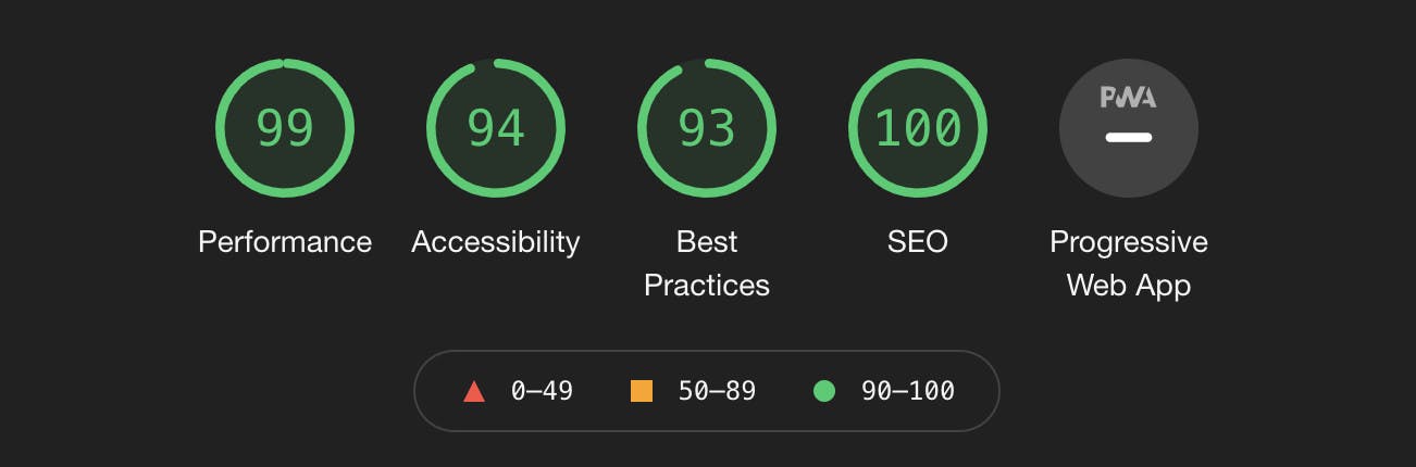
Those score are from a site that's years old and hasn't been touched.
Let's look at code.
I have a little page header component that shows a background image but switches out the image based on the width of the screen.
The mobile image is a square.
The above mobile image is 1440x700 image.
I could use the <picture> element... but I don't know if Gatsby supports this element and the <source> element.
This is typically how you would tell the browser to use completely different images for a section.
Here's the Final Component
There are some imports and an interface for props that's not shown in this snippet.
The Triangle is just an overlay on the image so it's not all straight edges.
const ImageContainer = styled.div`
  position: relative;
  display: grid;
  grid-template-columns: 1fr;
  grid-template-rows: 1fr;
  width: 100%;
  isolation: isolate;
  z-index: -1;
`;

const HeaderImage = styled.div`
  grid-column: 1 / -1;
  grid-row: 1 / -1;
  overflow: hidden;
`;

const TriangleContainer = styled.div`
  position: absolute;
  top: 0;
  left: 0;
  width: 100%;
  z-index: 1;
`;

export const HomeHeader: React.FC<HomeHeaderProps> = ({
  mobileImage,
  aboveMobileImage,
  altTag,
  titleTag,
}) => {
  const isAboveMobile = useMatchMedia();

  const imageData = isAboveMobile ? aboveMobileImage : mobileImage;

  return (
    <>
      <HeaderLogo />
      <ImageContainer>
        <HeaderImage>
          <GatsbyImage image={imageData} alt={altTag} title={titleTag} />
        </HeaderImage>
        <ImageOverlay />
        <TriangleContainer>
          <Triangle />
        </TriangleContainer>
      </ImageContainer>
    </>
  );
};
Notice I'm pulling in a mobileImage and an aboveMobileImage.
These are the image data for the two different images.
Rather than create two different image components and hide them in CSS based on a media query.
I use the same image component and with useMatchMedia I can tell the image component which image data to use based on the size of the screen. Even as it's resized... it's always listening in the background.
What you don't see is the default size useMatchMedia is using... 600px.
I'll show you in just a second.
FYI...
My CSS is using grid to create a stack for the image... an overlay that goes on top of the image... and then I'm absolute positioning a triangle shape so all of the lines aren't straight.
I am probably going to clean up my CSS because I don't like having the negative z value... but in good time.
I'll write an article soon about creating stacks... because I find that absolute isn't always the best option.
Here's My Match Media Hook Code
import { useState, useEffect, useRef } from "react";

export const useMatchMedia = (width = 600) => {
  const [shouldShow, setShouldShow] = useState<boolean>(false);
  const mediaQueryRef = useRef<MediaQueryList | null>(null);

  useEffect(() => {
    if (typeof window !== undefined) {
      mediaQueryRef.current = window.matchMedia(`(min-width: ${width}px)`);

      if (mediaQueryRef.current.matches) {
        setShouldShow(true);
      } else {
        setShouldShow(false);
      }
    }

    const test = (event: MediaQueryListEvent) => {
      if (event.matches) {
        setShouldShow(true);
      } else {
        setShouldShow(false);
      }
    };

    mediaQueryRef.current!.addListener(test);

    return () => {
      if (test) {
        mediaQueryRef.current!.removeListener(test);
      }
    };
  }, [width]);

  return shouldShow;
};
The Default
I'm setting a default width of 600. I think this is pretty standard for what a mobile phone media query is.
Though as I write this, I probably should update my media query values.
But you can pass in any width you want.
This means you can also use the hook multiple times in the same component.
Define State and a Ref
State holds if the hook should show the content you want to show... and it's state because you do need to trigger a re-render to get the new image on screen.
The ref holds the media query.
I used a ref because this value isn't going to dynamically change based on anything. So a ref seems ideal. No re-renders needed.
I guess I could rewrite this to make the width dynamic but I can't think why you would want this... plus it seems like it would get really complex really fast.
Let's not go there.
Inside the useEffect
First... check to make sure the window is available.
Second... we're creating the media query.
mediaQueryRef.current = window.matchMedia(`(min-width: ${width}px)`);
Notice I'm using min-width rather than max-width. That's just how I prefer to use media queries.
Third... we're doing an initial check to see if the current size of the view should trigger the media query. event.matches...
Fourth... we set up the function a listener is going to use to test whether the event.matches... and when it does flip the boolean.
Fifth... create the listener and pass it the test function.
Sixth... remember to remove the listener when the component gets unmounted.
Seventh... return the boolean so you can use it to change your UI... change your data... change whatever you want.
Try It Out
I use this a lot for conditional rendering.
I find it easier to manage than messing with the CSS of a component.
With useMatchMedia everything is in one place and easy to reason about.
However...
I love to learn so if you have a better implementation or a cooler way to using conditional rendering when then viewport changes... let me know!